
Paper and print
Paper matters
A poster isn't just the artwork. The paper, how colour is laid down, printer settings and proper file preparation all shape the final result. That's why the paper we print on wasn't chosen at random. We tested different weights and surfaces, comparing colour reproduction, black depth, detail sharpness, how the paper behaves in a frame, and how it looks under different light. We settled on 230 gsm paper — the result we expect from high-quality decorative print.
Why 230 gsm
230 gsm — noticeably thicker paper
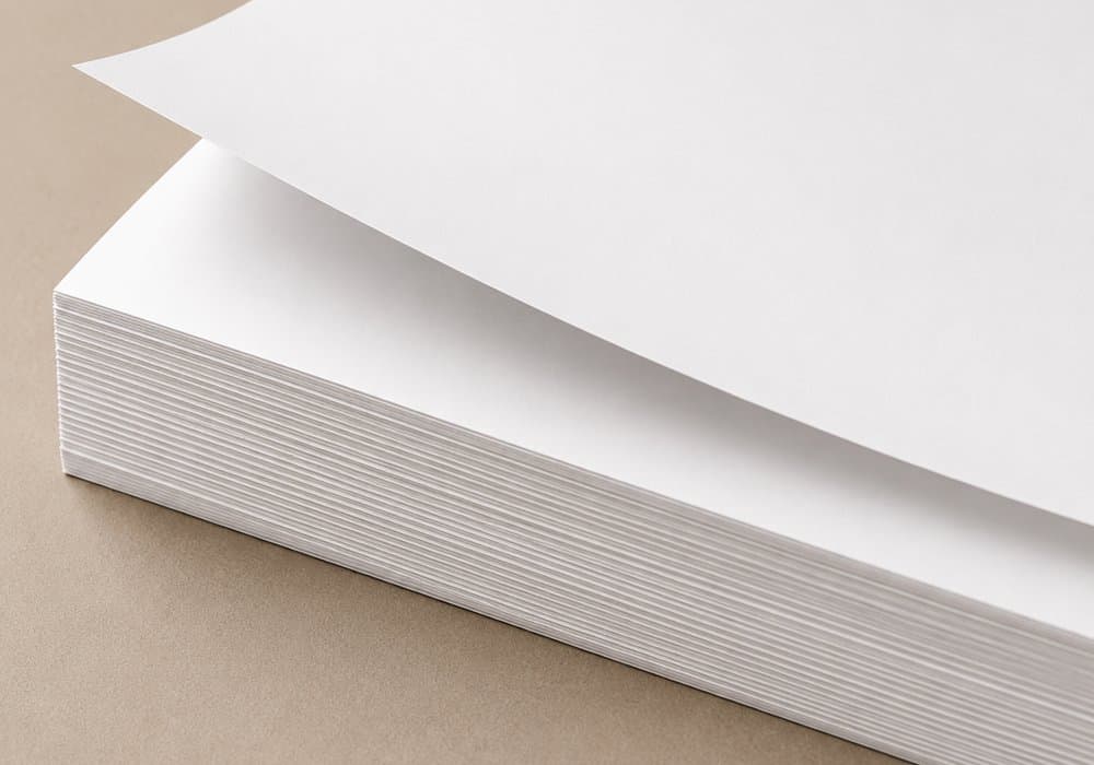
230 gsm makes a poster considerably more substantial than typical prints on thin paper. Rigid enough to sit well in a frame, it feels like a product made for interior decor, not an ordinary promotional print.
- more rigidity
- sits better in a frame
- a more substantial feel
- more resistant to accidental creasing in normal use
- looks better once framed
Rich, intense colour
Colour reproduction was one of the most important criteria in choosing this paper: intense yet natural tones, deep black, retained detail in highlights, and smooth tonal transitions. The right surface lets ink form a sharp, detailed image.
Deep black, strong contrast
Black is often what carries an image's depth, contrast and overall sense of quality. This paper produces strong dark areas without losing fine detail — important for photography, high-contrast graphics, film posters, illustration, black-and-white work and dark-background posters.
High level of detail
A poster's quality doesn't only show from a few metres away — what you see up close matters just as much: fine lines, textures, facial detail, material structure and small type. A smooth paper surface helps keep even small details legible.
Deep colour·Sharp detail·Elegant finish
Versatile, whatever you print
Great for photography
Photography is one of the most demanding print types — it shows colour quality, tonal transitions and detail. This paper performs well for portraits, family photography, travel shots, landscapes and architecture — colours stay vivid and the image keeps its natural character.
Just as good for illustration and graphics
The same paper works very well for digital graphics too: illustration, AI-generated artwork, abstract art, minimalist posters, typography, maps and architectural projects.
Elegant finish
A smooth, elegant surface brings out colour well and limits the strong glare typical of very glossy prints — less distracting sheen, without a hard mirror-like effect, even when light hits the poster at different angles.
Looks good in a frame
A poster exists to end up on a wall — so we also judged the paper on how it behaves once framed. 230 gsm gives the right rigidity and lets the poster sit evenly inside the frame.
Paper and print have to work together
- 01File
- 02Image prep
- 03Print settings
- 04Paper
- 05Check
- 06Packing

Chosen after many test prints
We didn't pick this paper from a manufacturer's catalogue alone — we ran many test prints, comparing photography, illustration, dark and light graphics, tonal transitions and fine detail, until we found a paper-and-settings combination that gave a repeatable result.
Print quality control
During production we check, among other things, colour accuracy, image sharpness, surface evenness, correct black reproduction, visible detail, and the paper's condition before packing.
Why we chose this paper
- 230 gsm
- solid, rigid structure
- smooth surface
- intense colour
- deep black
- high contrast
- strong detail reproduction
- smooth tonal transitions
- suited to photography
- suited to illustration and graphics
- elegant finish
- limited light glare
- sits well in a frame
- chosen from real test prints