
Quality and process
Colour under control
A good print isn't down to chance. Every poster goes through a precisely controlled process aimed at preserving image quality, the right contrast, deep colour and fine detail. We make sure every stage of production leads to one result: an attractive, consistent, repeatable print.
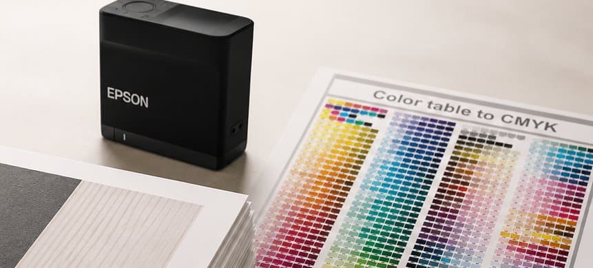
The same standard, every print
Quality can't be left to chance, so every poster goes through a defined control process – colour, contrast, black depth, tonal transitions, sharpness, detail, print surface, format and finish.
A repeatable quality standard
We make sure the move from design to finished print stays as controlled and repeatable as possible – whatever the artwork, the same standard applies to every order.
Colour that builds the image
Colour shapes a poster's whole character. We look after correct saturation, good depth, natural transitions, legible highlights and detail in dark areas – not about pushing every colour to the max, but about keeping the design's character intact.
Black that doesn't lose detail
Dark areas have a huge effect on an image's depth and contrast. We make sure black stays strong without swallowing fine detail – important in photography, portraits, dark-background graphics and black-and-white posters.
Smoothness, not random jumps
Subtle differences between tones matter especially in photography and gradient-based graphics. We look after smooth transitions between light and shadow, bright and dark areas, delicate skin tones, sky and soft backgrounds.
Precision·Repeatability·Quality control
Matched to the image's character
Colour matched to the image's character
Not every design should be maximally saturated. Photography keeps its naturalness, pastels stay soft, dark graphics keep their depth, and a minimalist poster looks clean and calm – what matters isn't just ‘strong colour’, but the right character for the finished print.
Precision you can see up close
A poster's quality should hold up close too. We pay attention to fine lines, textures, facial detail, material structure, small illustration elements and legible small type.
The whole image has to work together
Quality isn't just one colour or one detail – the whole impression matters: the balance of light and dark areas, the right contrast, natural depth, legible detail and colour consistency. Every one of these shapes how a poster reads once it's on the wall.
From image to finished poster
- 01Image
- 02Colour
- 03Detail
- 04Check
- 05Finish
- 06Finished poster

We check more than just colour
Once a print is made, its physical finish matters too – we check surface cleanliness, the absence of stray marks, correct format, straight edges and corner quality.
Precision down to the last edge
A poster shouldn't just look good – it should fit its frame correctly too. So dimensional accuracy and edge quality are part of our quality standard.
The final quality step
Before a finished product goes out for shipping, we check its condition and appearance: surface, print, edges, format and overall look. Quality isn't finished until the product is ready to be packed.
What quality control means to us
- colour control
- high repeatability
- deep blacks
- the right contrast
- natural tones
- smooth tonal transitions
- high level of detail
- legible fine elements
- image consistency
- an attractive finish
- accurate formats
- straight edges
- checking the finished product
- a check before packing
Every print·Every detail·The same standard